


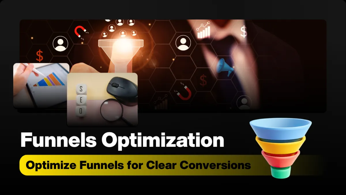
Optimize Funnels for Clear Conversions
A Funnel Should Make Things Obvious
Funnels are not just about squeezing more conversions out of traffic. At their best, they act like a clear, guided conversation with your ideal customer. A good funnel removes confusion, reduces friction, and makes the next step feel natural. That’s how we build funnels at Insert Fuel—where clarity is the strategy, not an afterthought.
Funnels Are Communication Tools, Not Just Conversion Machines
When most people hear “funnel,” they think of conversion rates, upsells, and A/B tests. Those matter—but they’re the outcome, not the starting point. The starting point is communication. A funnel is simply a structured way of answering three questions for your visitor:
Where am I? (Is this for me?)
What’s happening? (What are you offering?)
What should I do next? (What’s the obvious next step?)
When those three questions are answered clearly and simply, conversion improves naturally. When they’re not, no amount of design polish or clever tactics can save the experience. At Insert Fuel, every funnel we build is judged on one primary standard: does this make the next step obvious?
1. Why Most Funnels Fail: Unclear Messaging, Everywhere
Most funnels don’t fail because the product is bad or the design is ugly. They fail because the messaging is muddy. Visitors land on a page and have to work to understand:
Who this is for
What problem is being solved
What they’ll actually get if they say “yes”
Confusion is expensive. Every extra second a visitor spends trying to decode your page is a second closer to the back button. Common messaging mistakes we see when clients come to Insert Fuel include:
Jargon-heavy headlines that sound smart but don’t say anything concrete.
Mixed objectives—trying to sell, educate, and pitch three different offers on one page.
Vague promises like “transform your business” without specifying how, for whom, or by when.
A clear funnel, by contrast, feels almost obvious. The visitor thinks, “Yes, that’s my problem. Yes, that’s what I want. Yes, that’s the next step.” That’s not an accident—that’s messaging discipline. In our work at Insert Fuel, we start by stripping everything back to a single, sharp message per step in the funnel. Only then do we layer on design and automation.
💡 Insert Fuel Principle: If a stranger can’t explain your funnel page back to you in one sentence, it’s not clear enough yet.
2. The Power of Simple, Direct Offers
A funnel lives or dies on the clarity of its offer. Not the list of features, not the design of the button—the offer itself. A simple, direct offer answers three things without fluff:
What you get (the outcome or result)
What it costs (money, time, or information)
What happens next (the immediate next step after saying “yes”)
Compare these two offers for a free consultation:
Vague: “Book a call to explore potential synergies and growth opportunities.”
Direct: “Book a 20-minute call to identify 3 funnel tweaks that can increase your leads this month.”
The second one feels more “obvious” because it sets a clear expectation. The visitor knows what they’re getting, how long it will take, and why it’s worth it. This is how we frame offers inside Insert Fuel funnels: specific, time-bound, and outcome-focused.
💬 How we do it at Insert Fuel: Before we write a single line of copy, we define the offer in one plain-language sentence. If we can’t, we don’t build the page yet.
3. Trust Elements: The Quiet Drivers of Conversion
Even when the message and offer are clear, people still hesitate. That hesitation isn’t always logical—it’s emotional. This is where trust elements come in: reviews, proof, tone, and signals that say, “You’re safe to move forward.”
Reviews and Social Proof
Reviews and testimonials don’t just “look nice” on a page. They answer a silent question in your visitor’s mind: “Has this worked for someone like me?” The most effective social proof is:
Specific (“We added 37% more booked calls in 60 days.”)
Relatable (from similar industries, company sizes, or use cases)
Visible (near the point where a decision is made, not buried at the bottom)
Proof and Process Transparency
Proof is more than logos and star ratings. It’s also showing how things work. Simple process visuals like “Step 1 → Step 2 → Step 3” help people feel oriented. Case studies, screenshots, and short stories of client wins make the journey believable, not theoretical.
Tone: How Your Funnel “Feels”
Tone is often overlooked, but it’s one of the strongest trust signals. Is your copy pushy or respectful? Overhyped or grounded? At Insert Fuel, we aim for a tone that is confident but calm. We want the funnel to feel like a helpful guide, not a loud salesperson. That sense of calm clarity does more for conversion than another flashing countdown timer ever will.

Clear messaging plus visible proof consistently outperforms clever design alone in funnel tests.
4. One Clear Action Per Page: The Discipline of Focus
If a funnel is a guided conversation, each page is a single question. When you ask three questions at once—“Book a call, download this guide, or check out our blog?”—you don’t look generous; you look indecisive. Visitors feel that indecision and mirror it. They hesitate, then leave.
One clear action per page creates momentum. Examples:
A lead magnet page: “Download the guide.” That’s it. No menu, no side offers.
A booking page: “Choose a time.” Not “Also join our newsletter.”
A sales page: “Start your trial” or “Buy now”—not both.
📌 Insert Fuel Standard: Every funnel page we ship has one primary CTA. Anything that competes with that CTA is removed, moved, or turned into a supporting element.
This discipline does two things:
It makes the visitor’s decision easier (less mental load).
It makes optimization cleaner (you know exactly what each page is supposed to achieve).
When the action is obvious, people are far more likely to take it. That’s the quiet power of focus inside a funnel.
5. How GHL Funnels Help Structure Decision-Making
Go High Level (GHL) gives you a powerful toolkit for building funnels—pages, forms, automations, pipelines, and more. But the real value isn’t just the tools; it’s how you use them to structure decisions. At Insert Fuel, we treat GHL as a way to map the customer’s thinking, step by step.
Mapping the Journey, Not Just the Pages
Inside GHL, each step in a funnel corresponds to a specific decision:
Awareness: “Is this relevant to me?” (Landing page with a clear promise)
Interest: “Do I want to know more?” (Lead capture with a focused offer)
Evaluation: “Can I trust this?” (Emails, case studies, proof pages)
Decision: “Is this the right step now?” (Sales or booking page)
GHL’s automations then allow us to respond to how people move through that journey. For example, if someone opts in but doesn’t book a call, they can enter a follow-up sequence that:
Answers common objections
Shares a relevant case study
Repeats the offer in a simpler, more direct way
The goal is not to bombard them with messages, but to clarify the decision they’re already considering. This is how we use GHL at Insert Fuel: as a framework for guiding decisions, not just a place to host pages.
Clarity in the Backend, Clarity on the Frontend
A messy backend usually leads to a confusing frontend. In GHL, we keep funnels organized around stages of clarity, not just asset types:
Pipelines that mirror buyer stages (New Lead → Nurturing → Ready to Talk → Client)
Workflows that match specific decisions (Booked call, no-show, requested more info)
Tags that represent real behaviors, not just campaign names
When the structure behind the scenes is clean, it becomes much easier to keep the customer experience clean too. That’s the Insert Fuel approach: clarity in the tech, clarity in the journey, clarity in the message.
6. Looking Good vs. Making Sense
It’s tempting to judge a funnel by how “modern” or “premium” it looks. Clean fonts, nice colors, slick animations—these can help, but only if the page first makes sense. We often see funnels that are visually impressive but logically confusing:
Beautiful hero sections with headlines that don’t say what the offer is.
Carefully designed sections that repeat the same vague benefit in different words.
Multiple CTAs styled identically, each leading to different actions.
Design is still important. It sets the tone, builds trust, and can make information easier to scan. But the hierarchy is clear:
First make it make sense, then make it look good.
At Insert Fuel, we design after we’ve proven the message and structure. That’s how we protect performance from “pretty but pointless” changes.
Bringing It All Together: Funnels That Feel Natural
When you treat funnels as communication tools, everything shifts. Instead of asking, “How can we push harder for the sale?” you start asking, “How can we make this decision easier and more obvious?” The result is a funnel that feels less like a trap and more like a guided path.
Messaging that is clear, specific, and free of jargon.
Offers that are simple, direct, and outcome-focused.
Trust elements that quietly reduce fear and hesitation.
Pages that each ask for one clear action, and nothing more.
GHL funnels structured around real decisions, not just assets.
Design that supports clarity instead of distracting from it.
This is the Insert Fuel way: clarity first, always. We don’t build funnels just to exist. We build funnels to make decisions obvious—for your visitors, for your team, and for your business. When that happens, conversion stops feeling like a fight and starts feeling like the natural outcome of a clear, honest conversation.
If your current funnel looks good but doesn’t perform, the problem might not be the tool or the traffic. It might be clarity. And clarity is fixable. One page, one message, and one obvious next step at a time.